The desk name plate grew up. This is a full standing sign for a counter or an event table: a logo up top, a title with a line under it, a big QR people can scan, and room for a sentence or two. It prints as two flat parts and slides together, the same trick as the name plate, just scaled up to read across a room.
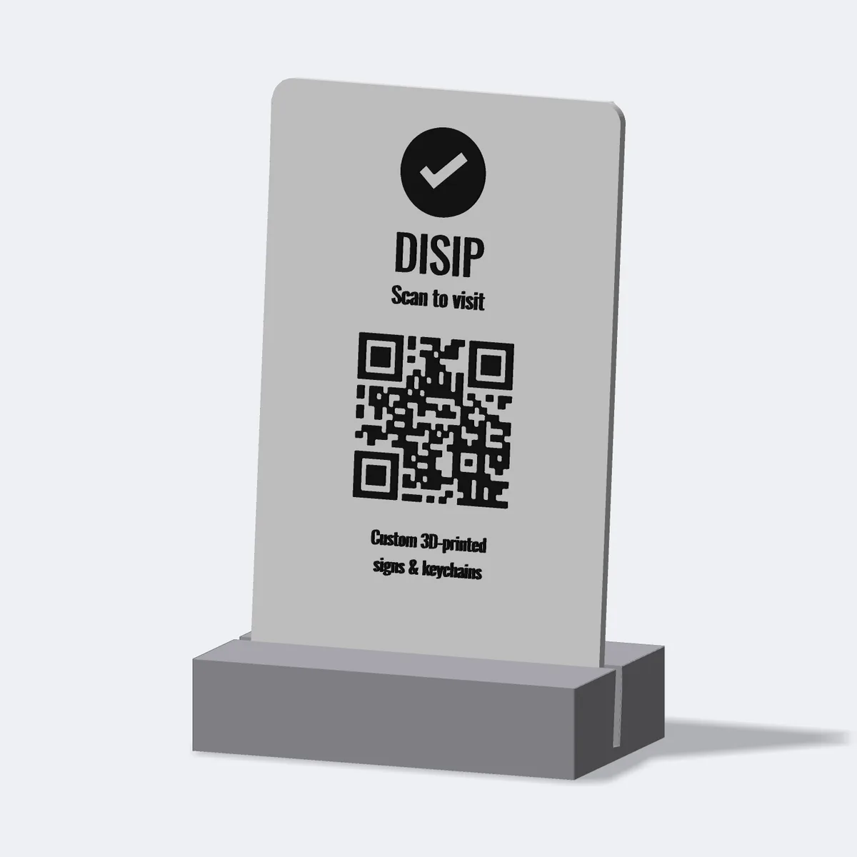
A foot deep enough not to tip
A tall sign on a thin base is a sign on the floor. The taller the plate, the higher its weight sits, and the easier it topples when someone brushes past. So the holder is not a token slot, it is a deep foot, and its depth grows with the plate, around forty percent of the plate height. A tall menu board gets a long foot, a short table card gets a stubby one, and both stay where you put them.
Spacing is the hard part
Stacking text is easy. Stacking it so it looks designed is not. Equal gaps between everything read like a spreadsheet, not a sign. So the spacing is grouped: a title and its subtitle sit close, like they belong together; the QR gets real air above and below so it stands out and stays easy to scan; the body lines tuck in tight; and the top and bottom margins match so nothing looks like it slipped. Every gap is a slider if you want to fuss with it, but the defaults are set so you do not have to.
Put your logo on it
Upload an SVG and it prints above the title. There is an invert switch for logos drawn as a shape sitting inside a filled badge: flip it, and the badge becomes the raised part while the shape cuts into it, which is usually what you want for a cut-out mark. Behind that switch was a small bug. Some SVGs carry a full-size background rectangle, and that rectangle used to either lift the whole plate or leave a faint outline around everything. Now it gets thrown away before anything is extruded, so the logo prints as just the logo.
The QR has to survive being plastic
A QR on a screen always scans. A QR in plastic does not, if the squares get too small the printer smears them together and a phone gives up. So when your link is long and the code packs in tight, the designer tells you to make it bigger or shorten the link before you download. The engraved finish needed its own care: when the ink sinks level with the surface instead of standing proud, the shapes get welded together by a fraction of a millimetre before they are carved, just enough to keep the cut watertight without closing the gaps the code needs to read. The QR on this one opens disip.nl. Yours opens wherever you point it.
Make one
Drop in your logo, write the title, paste a link, and the QR builds as you type. Pick raised or engraved and your three colours. Download the file, print both parts, scan-test the code, and slot them together to stand on a counter. If you want a made-to-order product like this in your own shop, that is the kind of thing disip builds.